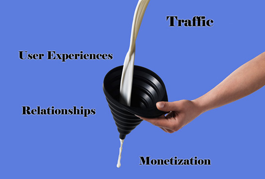
Presenting a product for purchase – moving your prospects from visitor mode to buyer mode.
For those sites that monetize by selling products this is often the most important step of the funnel. It is all well and good to have people read your helpful content and even to continue to engage with your site or newsletters on a regular basis. But while you want to grow an audience, you need at least a chunk of them to eventually convert or else the exercise is not commercial. Likewise, if you are ad supported, you need some level of demonstrable ROI to show your advertisers, unless they are just concerned with brand impressions, which is less and less common. So someone needs to click on something.
How do you get visitors to consider buying something and how do you measure it?
Some people will measure the conversion from relationships to customers as one big step. I prefer to break it down further to two steps (or even three): purchase consideration and store check out process. Each of these steps is measurable and is effected by different drivers. If optimization and revenue maximization is your goal, it helps to attack each step separately.
The first step is to get your relationship or visitor into the store or into the mode to think about buying your product. The key metric here is the visit to the store or product page, though some tactics skip this step all together and drive clicks directly to the shopping cart itself. The key tactic is to present the target with an offer. This can either be in reaction to users, such as displaying a special offer callout on a content page they are visiting, or can be proactive, such as sending the user an offer specific email.
In future posts, we will go into much greater detail on the strategy and tactics behind specific emails and broader communications approaches. There are a wide number of inputs that drive their success, from the frequency of touch, to the mix of content and commerce, to the specific types of offers you present and the creative you use to do so.
For today’s post, we will stay at a macro level and note the fact that the key aspect of conversion analysis here is to measure the effectiveness of tactics based on both the click through rate (CTR) they achieve, as well as the downstream metrics of orders/click and dollars/click. As we have said before, too keen a focus on the immediate metric (CTR) can lose the forrest for the trees. At the end of the day, it is all about the dollars that come from the activity. So do not stop your analysis between approaches at the one that produces the best CTR.
You can actually logically connect certain creative approaches to higher click through rates that have lower sales rates. Pitching something for free that actually has a cost is the clearest example. In so called “direct PPC” campaigns that focus on selling something immediately to those who click, driving down CTR can actually have a highly positive effect by focusing on those who are serious about buying something vs. those who never intended to buy, but were “just looking” or seeking a freebie. When you are paying for that click, you want a high ratio of buyers within clickers.
So if the key metric is visits to the store, which in turn is driven by CTR of site visitors or email readers, etc., what are the core drivers to effect that number? The main variables are within the offer or the pitch itself. What product are you offering? Do your prospects know the product? Where is the price point? Is it discounted? Are there special aspects beyond price, like free shipping? How are you describing the offer? What benefits are you presenting? What copy or visual creative are you using? Each of these elements can be tweaked and tested to optimize results.
Outside of the offer, what other factors drive success? How relevant is the offer to its context? In other words, does it match the content it sat next to? Displaying call-out ads on a site that relate to the content pages themselves will tend to have a much higher rate of engagement. If you run a home improvement site, ads for painting gear will generally drive better results sitting in the painting how-to section than generic home-improvement ads in their same spot. This sounds obvious, but it is amazing how many sites take a one size fits all approach.
In the next installment, we will finally examine the final step of the online conversion analysis funnel, the shopping cart and driving higher close ratios.
Photo by macmuc


